
HealthTree is an international cancer foundation that helps patients extend their lives by combining their personal disease data with treatment information, education, specialists, and community support.
Founding designer — brand, product, web & print
30%
Company-reported user growth
120%
Company-reported funding increase
80+
Page designs
40+
Interface components
Project overview
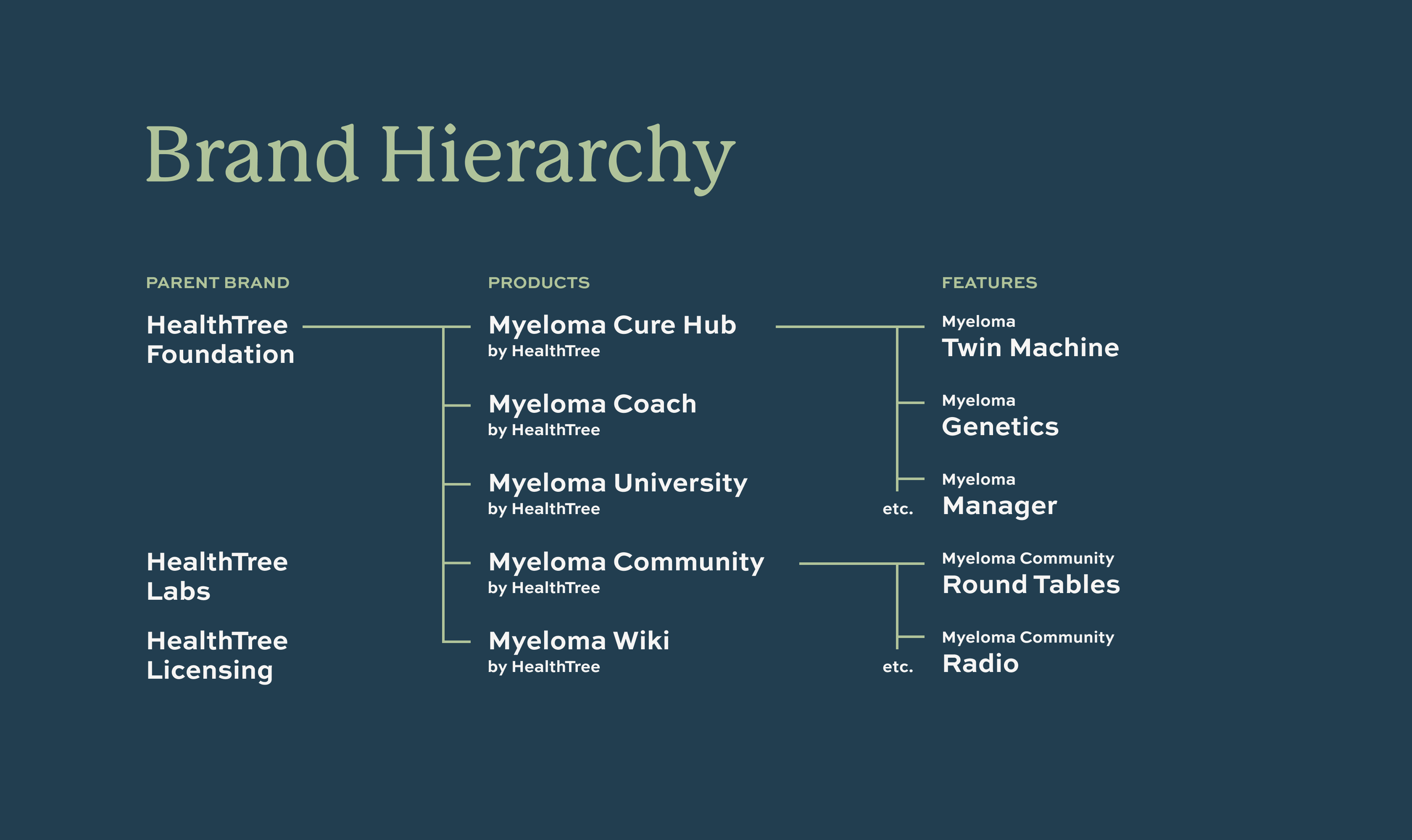
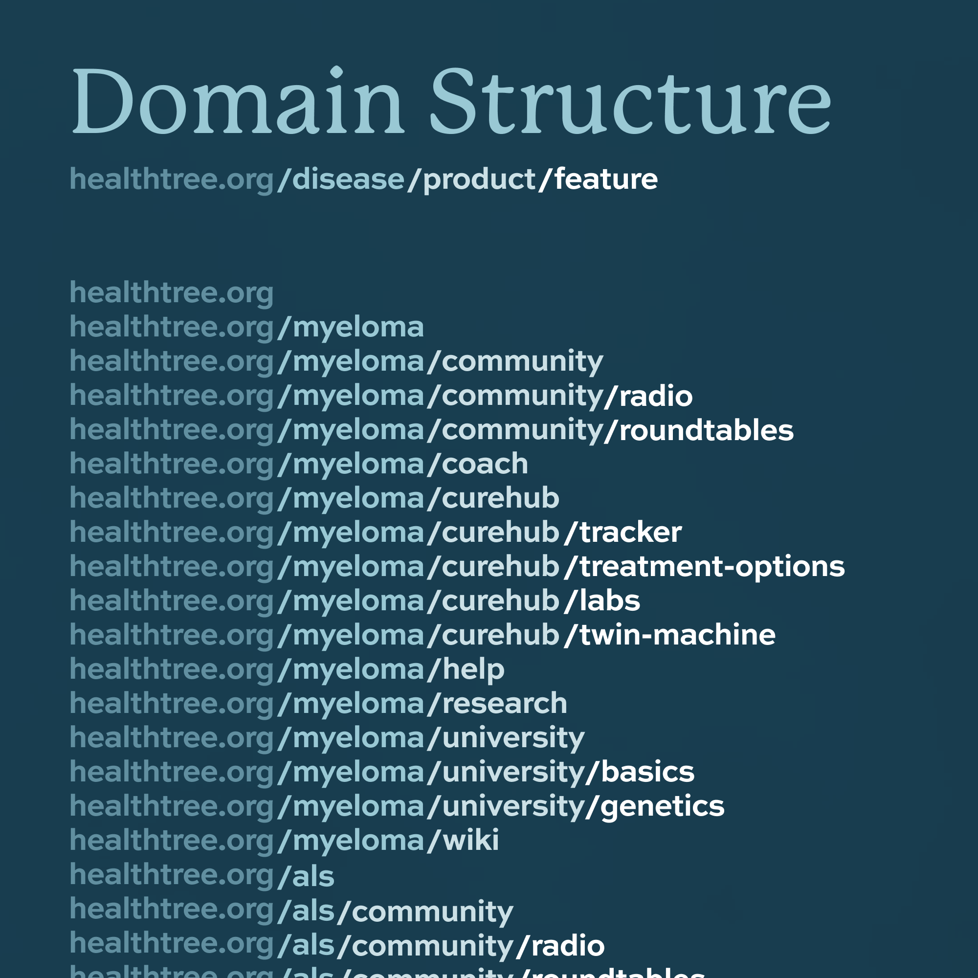
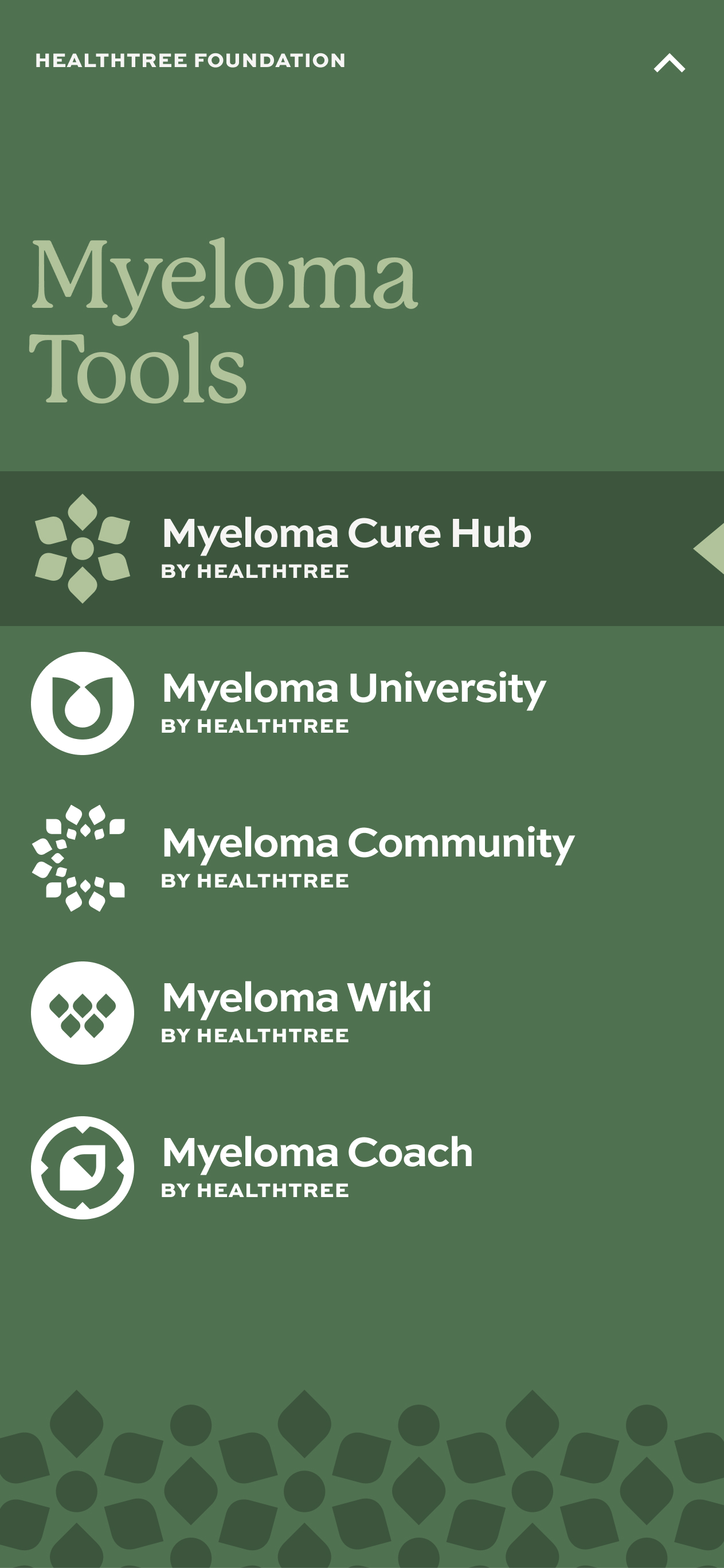
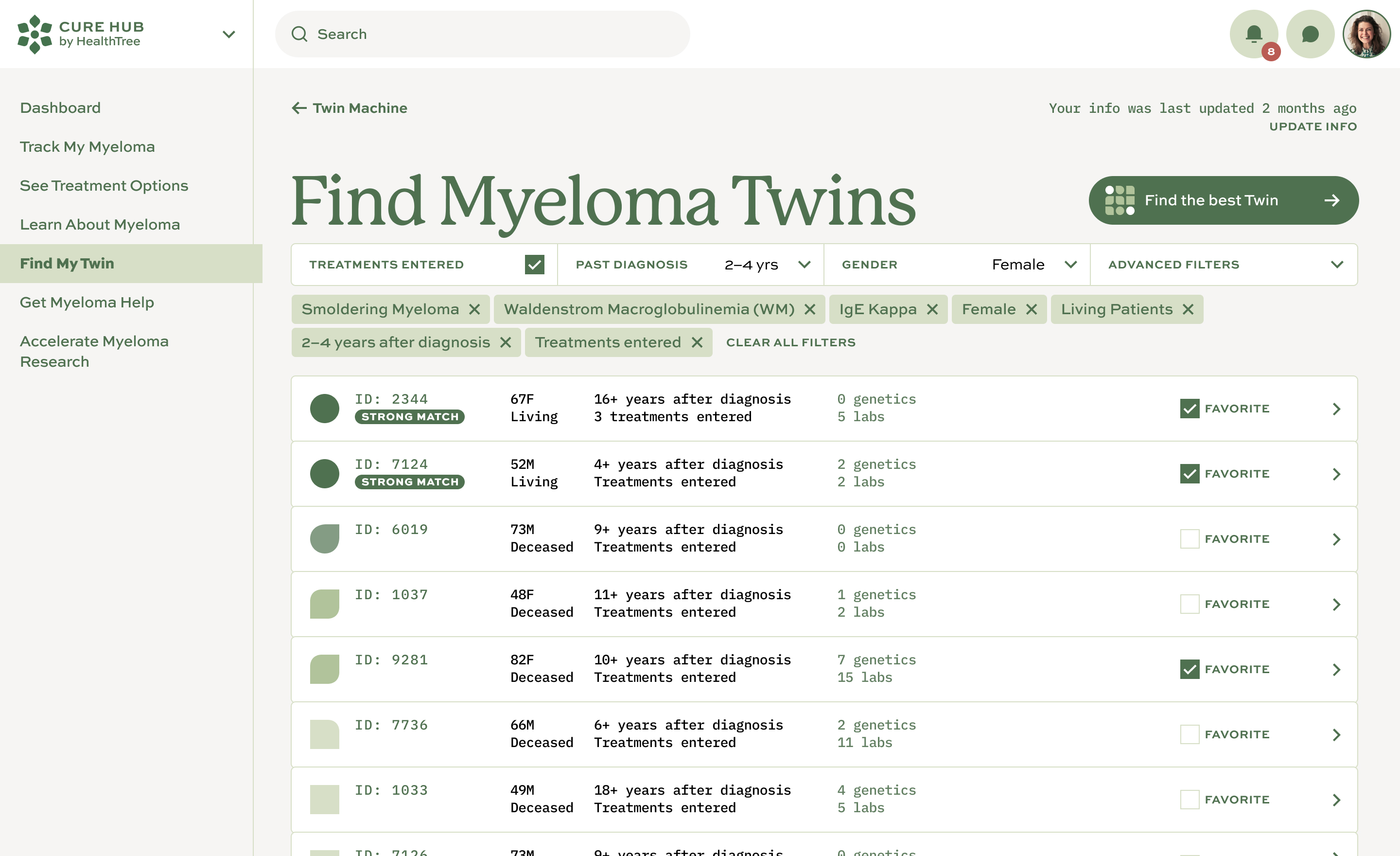
HealthTree was expanding from one core product into a much larger patient ecosystem, but early users were apprehensive about the app and confused by the organization behind it.
Research showed the existing parent name and visuals felt more like a pharmaceutical company than a patient-centered nonprofit. The work therefore had to solve the organization, brand, and product experience together.
New patients strongly resonated with the idea of a cure.
88% of people polled preferred the HealthTree name over CrowdCare.
People often interpreted MyelomaCrowd as only a support group.
The word “foundation” added substantial credibility.

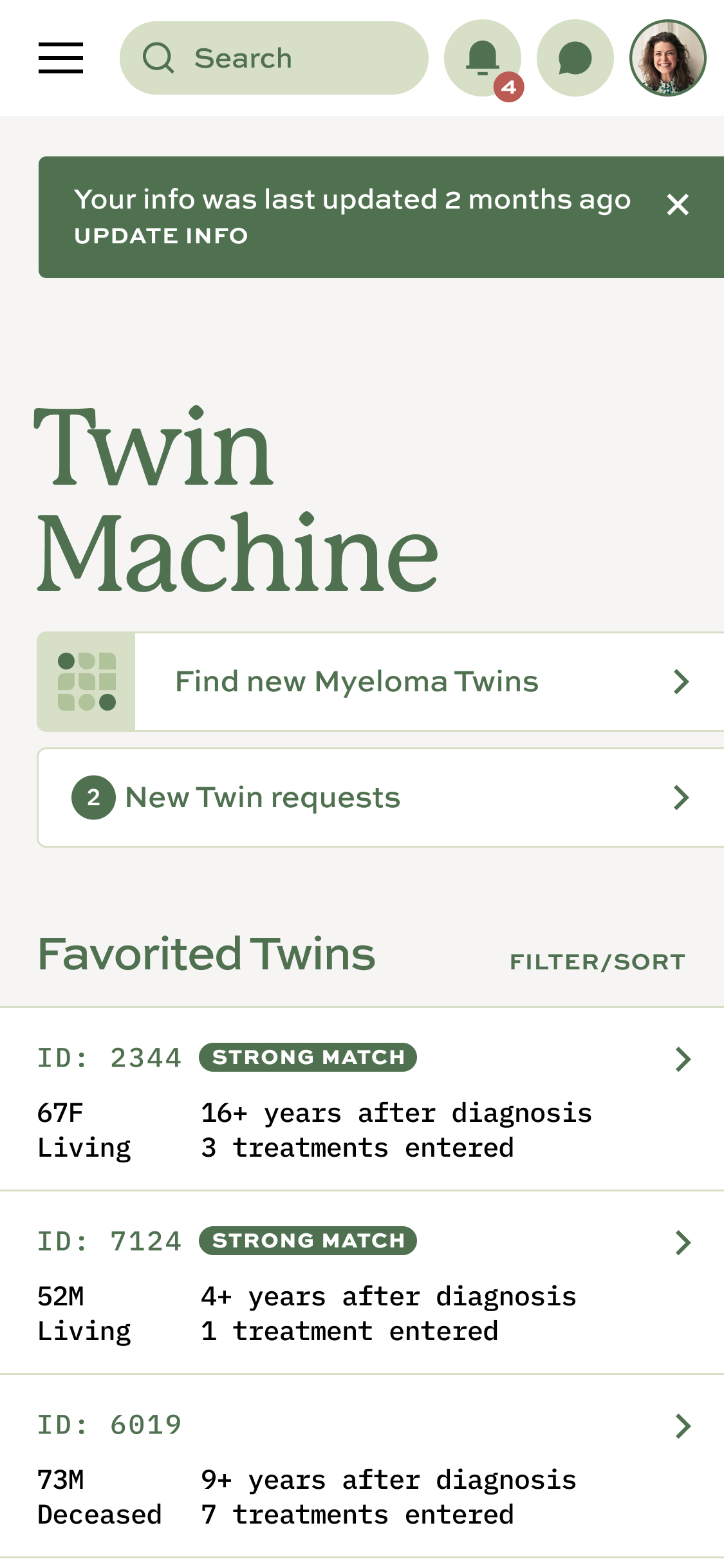
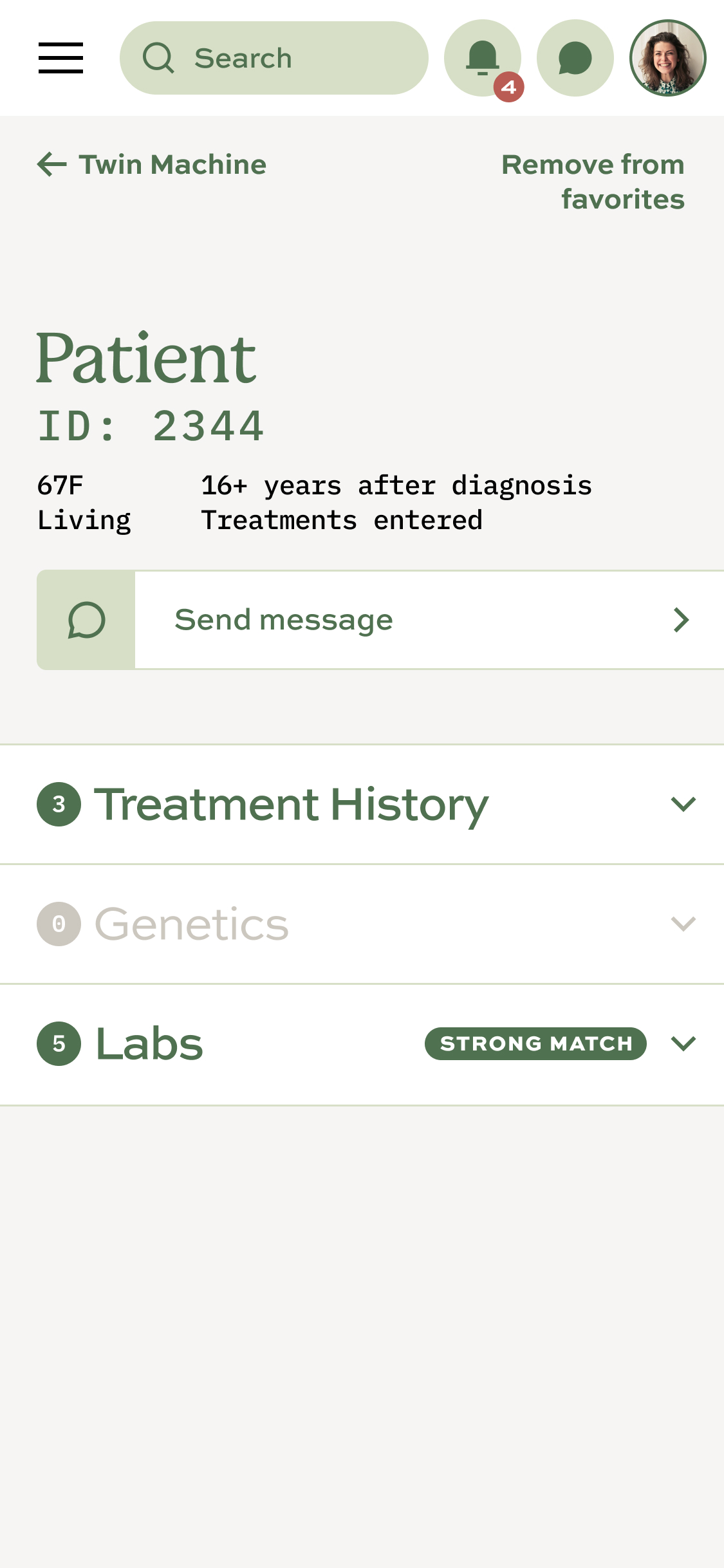
Making patient data useful
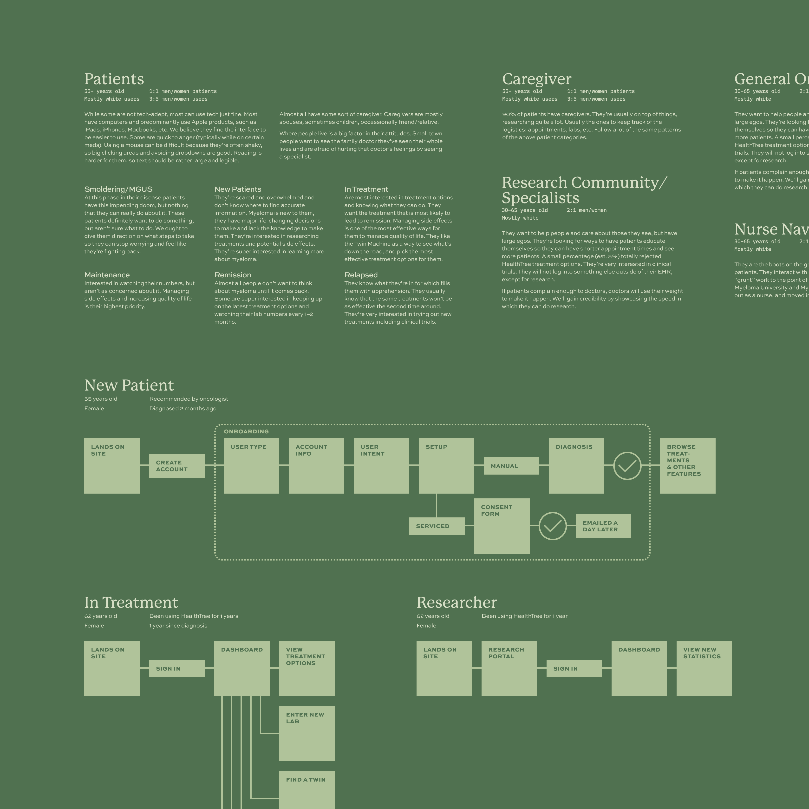
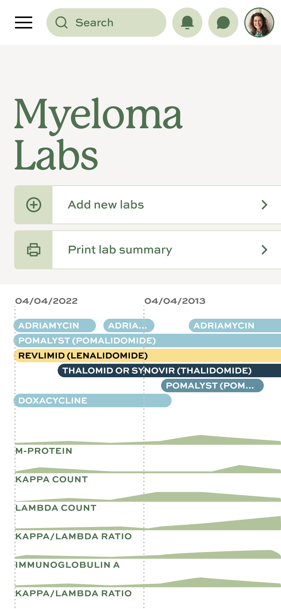
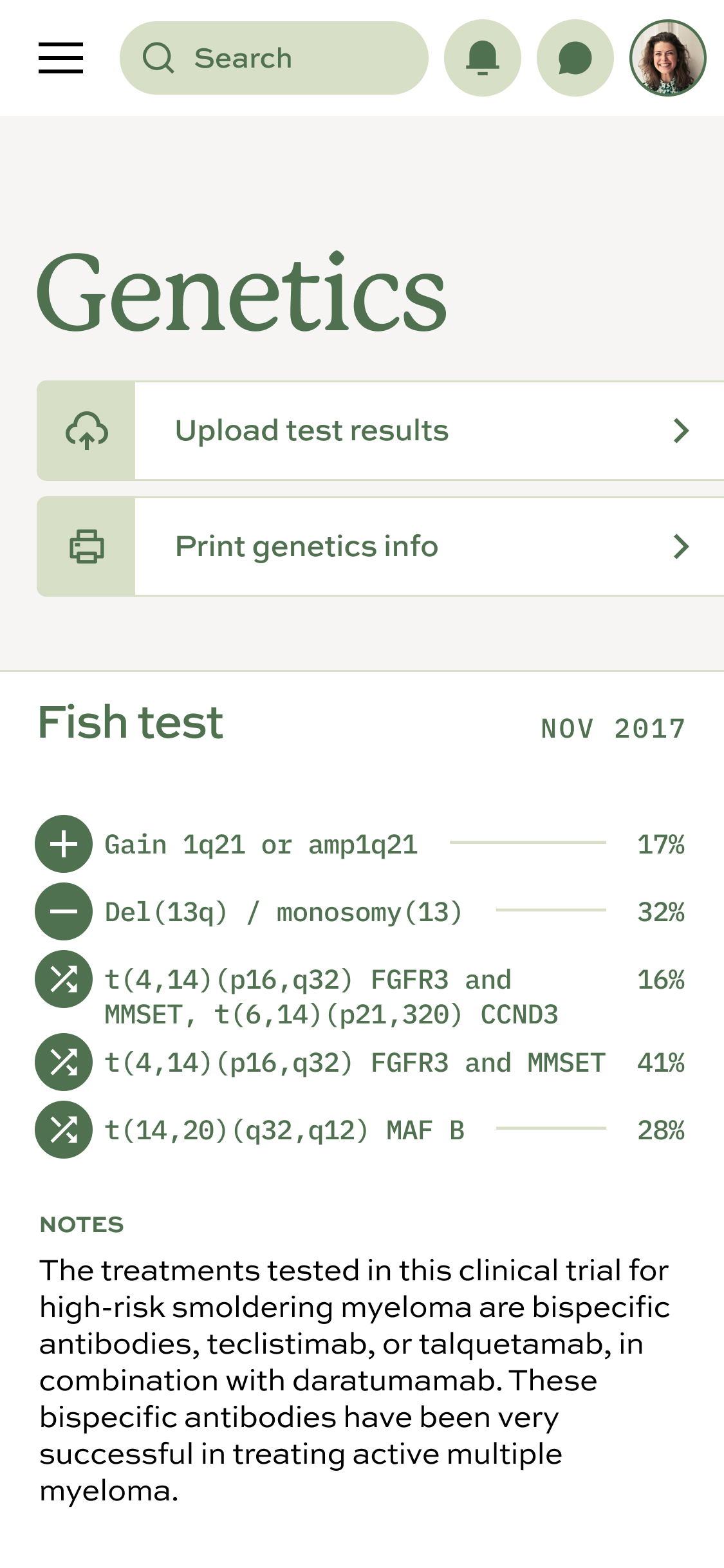
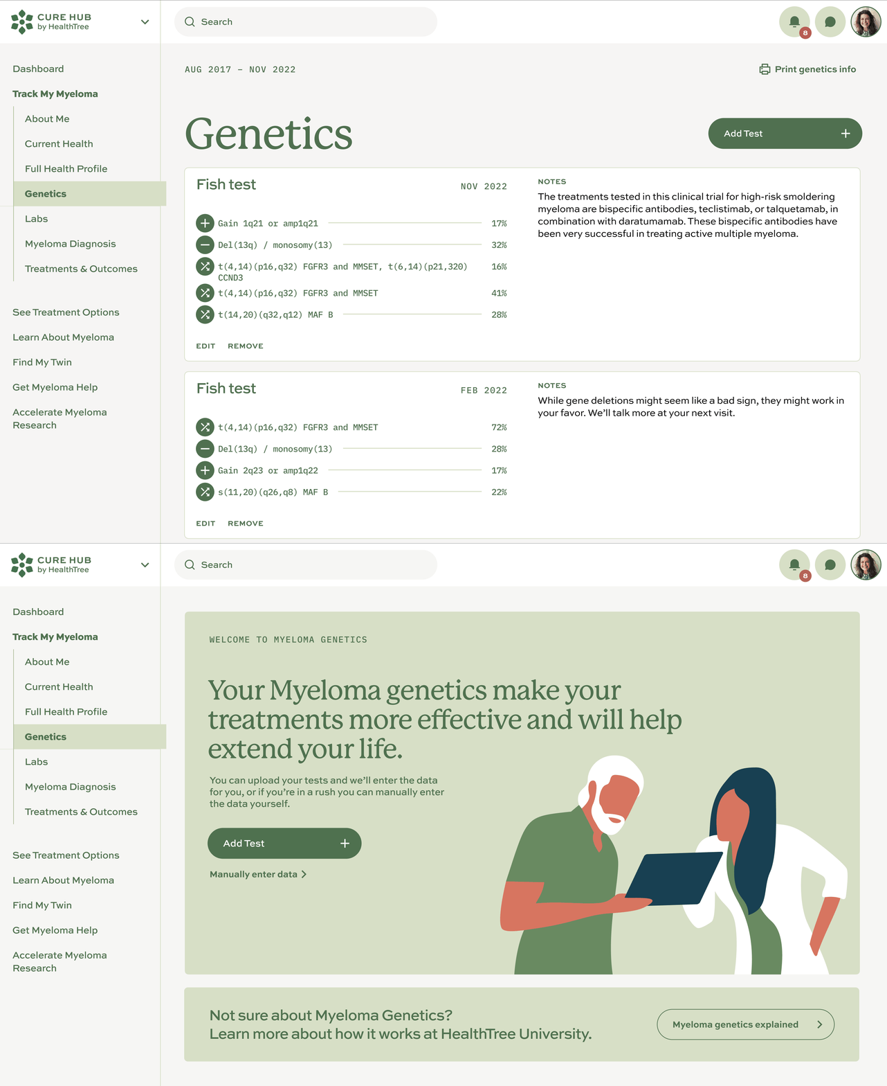
A patient’s myeloma data is central to treatment decisions. The product needed to make complex lab results understandable while showing how treatment changes affected them over time.
Patients became deeply engaged in entering historical lab results because each entry changed the graph. The interface gave them both useful insight and a greater sense of control over an uncertain treatment journey.
Education and emotional support
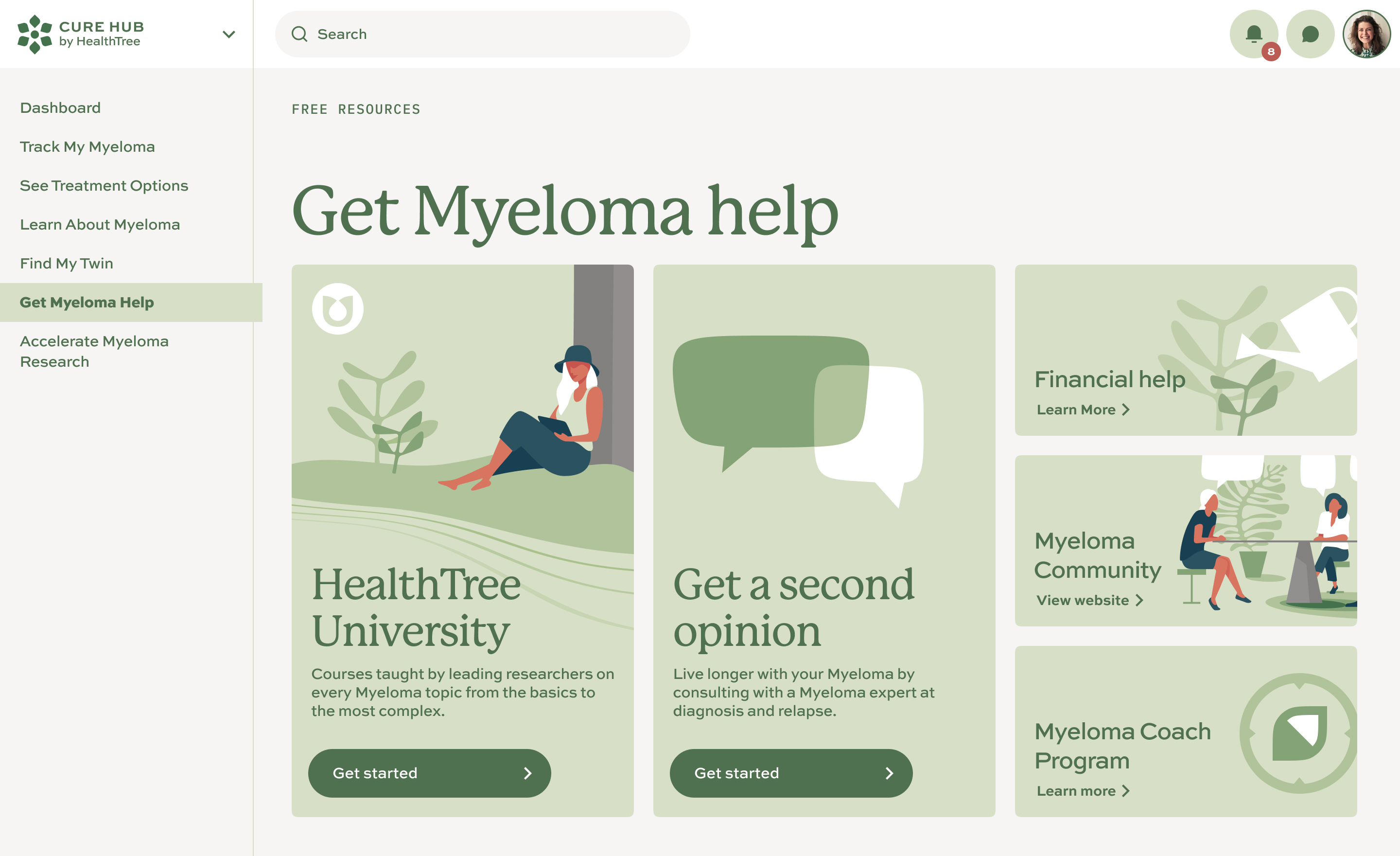
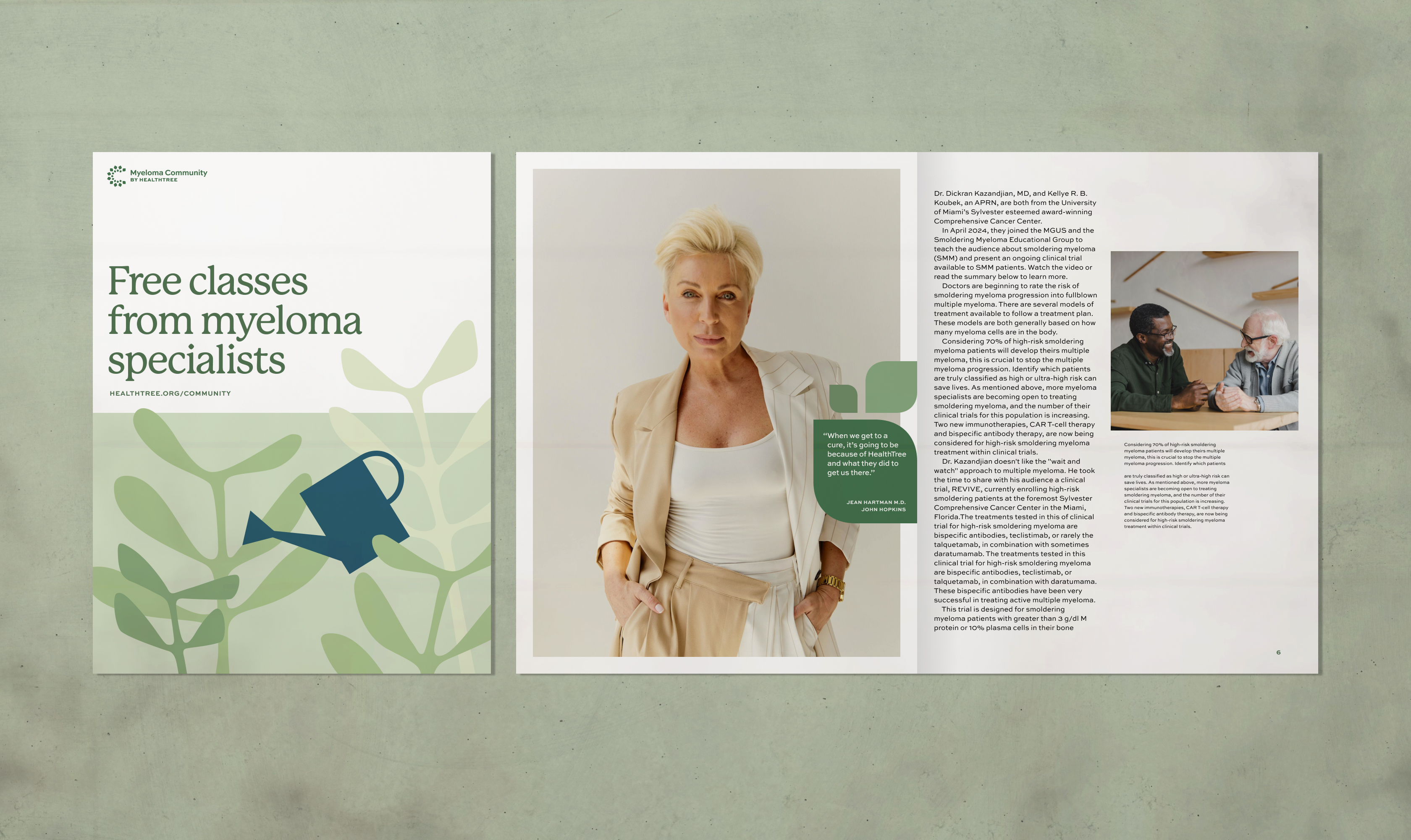
The data only mattered if patients understood it, so education became part of the interface rather than a separate destination.
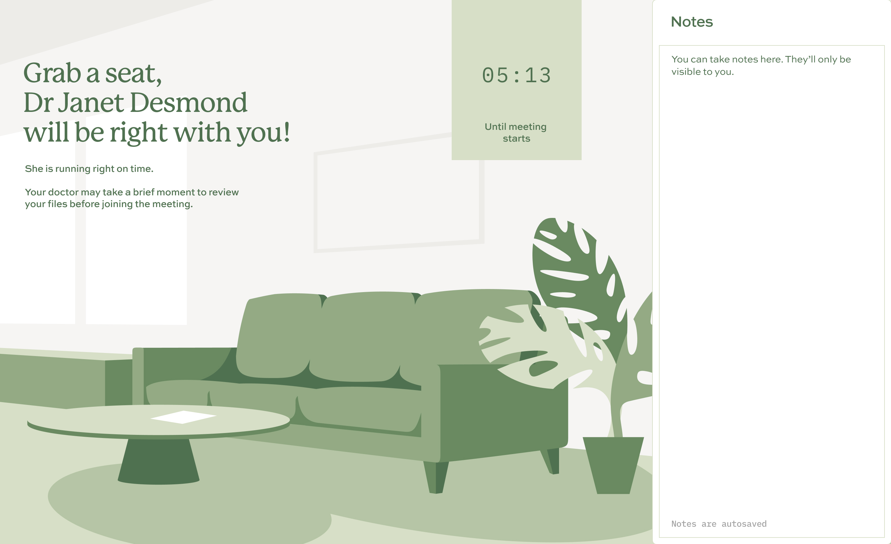
Default states and contextual links introduced relevant HealthTree University resources before and while patients entered their data. Calming visuals and empathetic communication were used most deliberately in moments likely to create anxiety.
Outcome
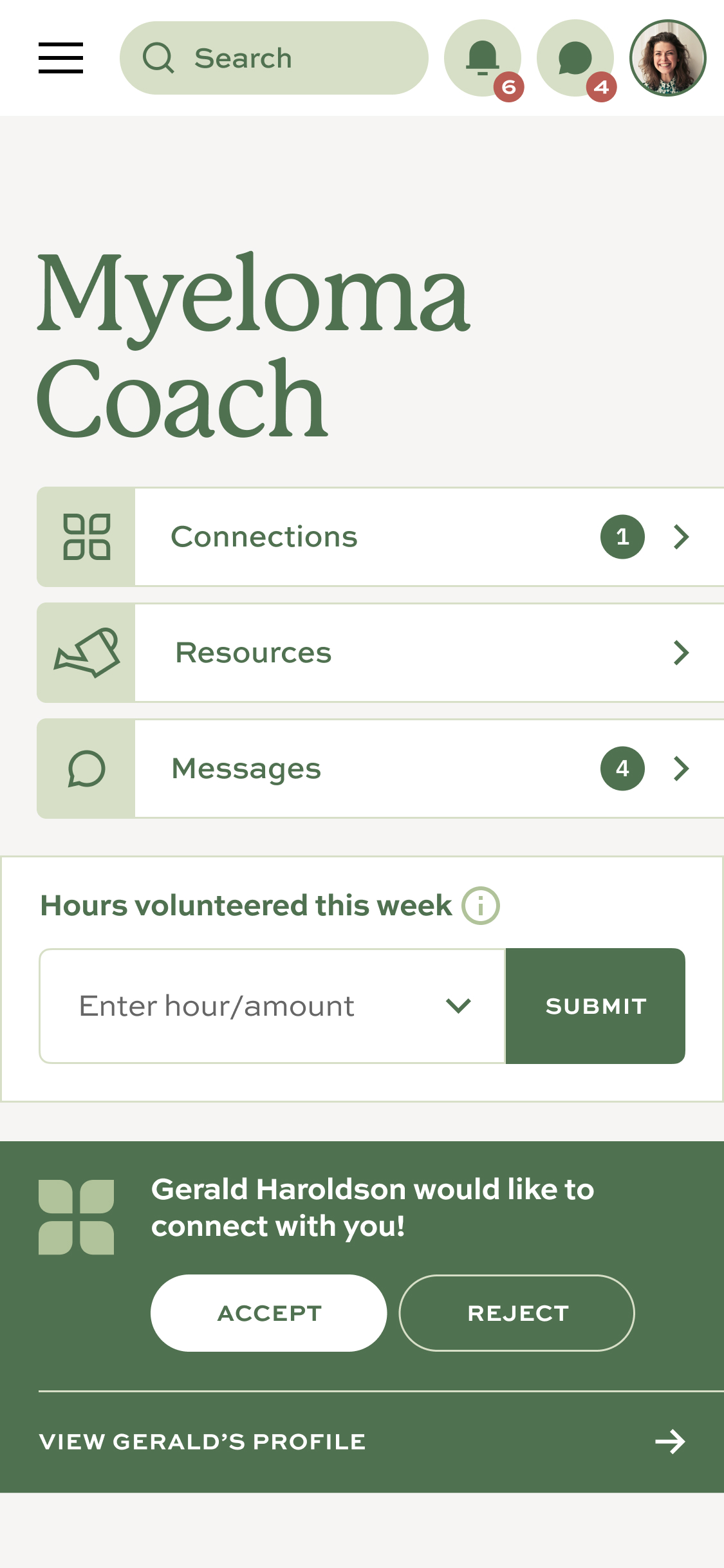
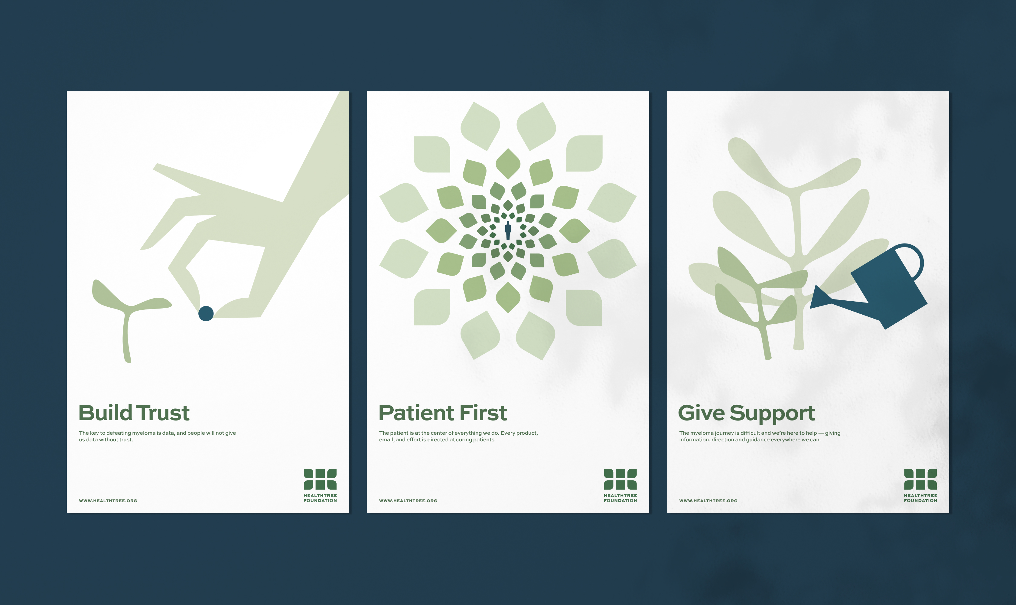
The rebrand and expanded product ecosystem gave the organization one patient-centered system across identity, education, treatment data, and support.
Following launch, company leadership reported approximately 30% user growth, improved retention, and a 120% increase in funding within one year.